7 Things to Consider When Selecting Colour
#1 User Preferences
7 Things to Consider When Selecting Colour
#2 Lighting
7 Things to Consider When Selecting Colour
#3 Type of Activity and Client Time in the Room
7 Things to Consider When Selecting Colour
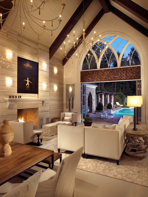
#4 Adjacent Room
7 Things to Consider When Selecting Colour
#5 Mood and Atmosphere Created
7 Things to Consider When Selecting Colour
#6 Existing Colours of Components

7 Things to Consider When Selecting Colour
#7 Style or Theme
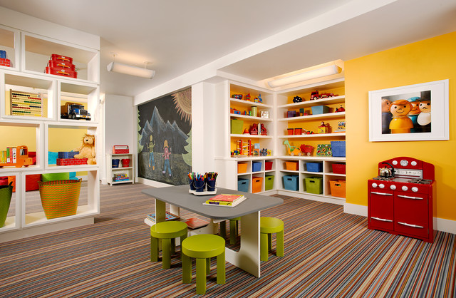
Colour Schemes based on Primary Colours


Colour Schemes based on Secondary Colours


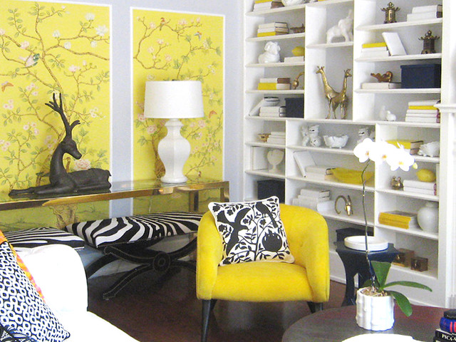
Colour Schemes using Complimentary Colours


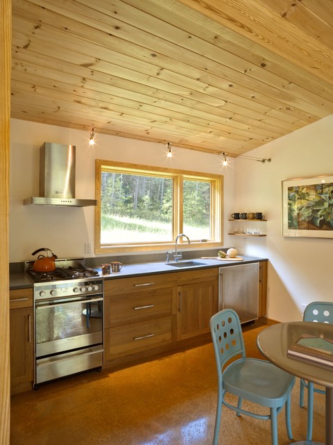
Colour Schemes based on Warm Colours


Colour Schemes based on Cool Colours


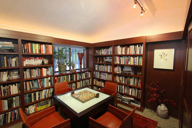
Monochromatic Colour Schemes


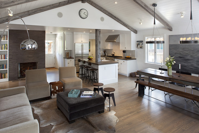
Neutral or Achromatic Colour Schemes


Use of Texture in Interior Design


Three Awesome Accessories


Three Variations on Drapery Styles


Three Variations on Wall Coverings


Three Examples of Interesting Lighting


Hue:
a gradation or variety of a color; base color
Intensity:
is the amount of color. The lower intensity, the more gray the color is.
Value:
is the whiteness/brightness of a color. A value of 0% would be black, while a value of 100% would be the pure color.
Tint:
the mixture of a color with white, which increases lightness.
Shade:
the mixture of a color with black, which reduces lightness.
